Industry
Finance
Company
Farabi Financial Group
Transforming "Dead Space" into Dynamic Engagement
Redesigned the Header from a static greeting to an interactive, multi-purpose widget system, driving higher user engagement.
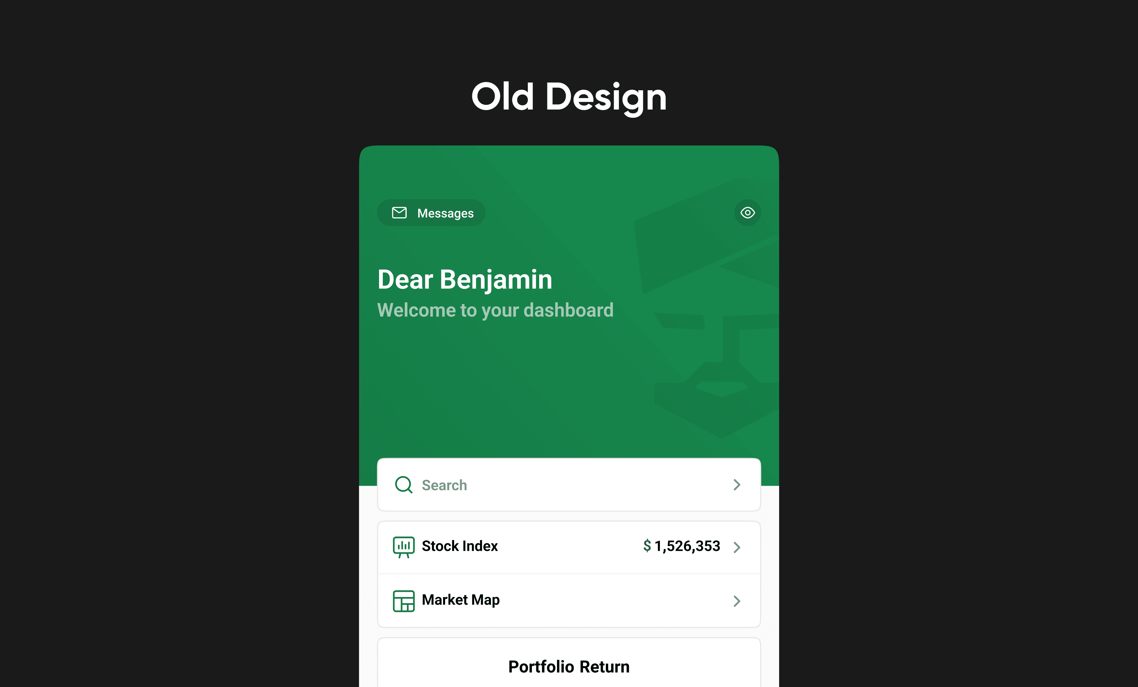
Why the Original Header Wasn't Working
In financial trading apps, screen space is highly valuable. However, the first design of our mobile dashboard wasted its best spot: the top header. It only showed a simple greeting like "Dear Benjamin, Welcome." We wanted to increase user engagement and help users make faster trading decisions. This led us to three main challenges:
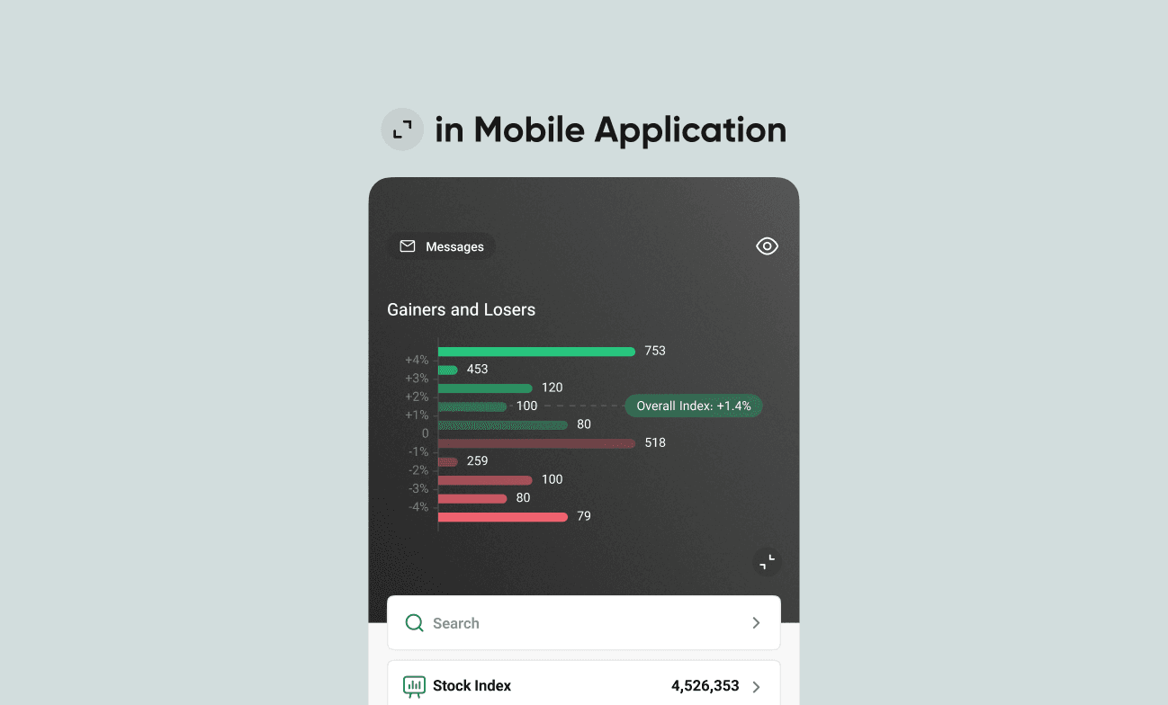
Friction in Decision Making: Important market data, like "Gainers and Losers," was hidden deep inside the app. Traders had to leave the home screen to check market trends, which slowed down their trades.
Missed Engagement Opportunities: The top header took up the most visible space on the screen, but it offered no useful financial insights or a clean area for business promotions.
Lack of Scalable Space: The business needed a way to promote new features without using annoying pop-ups. We also needed a design pattern that worked well across different pages while keeping a consistent look.
Exploring Solutions: Gestures and Architecture
To solve this, we started with competitor benchmarking and team whiteboard sessions. We needed to show complex market data without making the screen look too busy. This information architecture challenge led us to test two interactions in our low-fidelity wireframes:
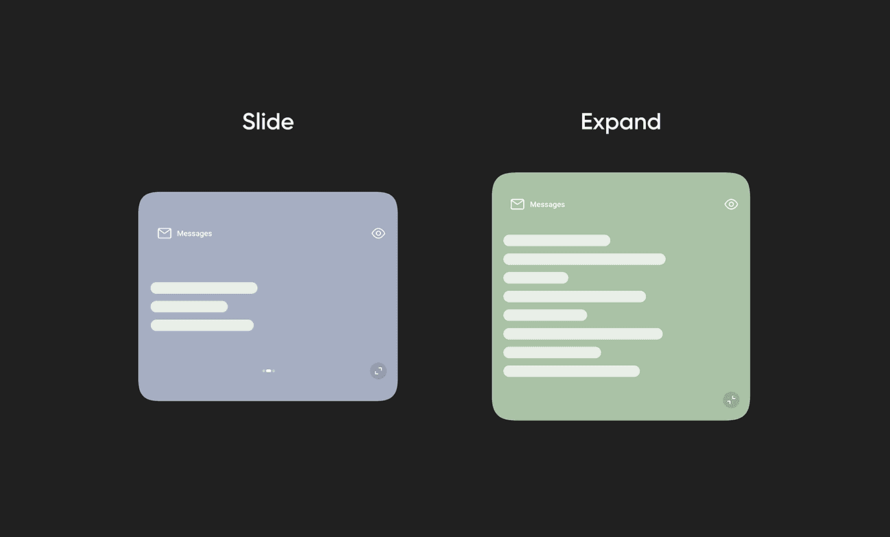
Horizontal Swipe: We created a carousel for top-level summary cards and promotional banners.
Vertical Expand: To keep the main screen clean, we added a pull-down action. This hides detailed analytics until the user actively looks for them.
Testing these interactions early helped us build a strong, scalable pattern for both the Home and Portfolio sections.
Designing the High-Fidelity Interface
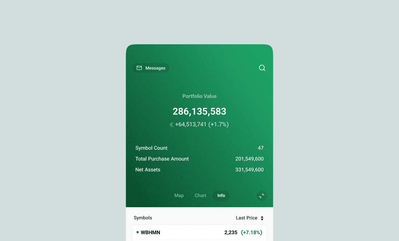
When creating the high-fidelity UI, my main goal was to build a clear visual hierarchy. This helps users read complex financial data quickly. I turned the wireframes into a polished "command center."
For data visualization, we made a strategic choice to put the "Gainers and Losers" chart right inside the expanding header. I designed a clean horizontal bar chart using standard industry colors: green for positive growth and red for negative trends.
Final Results and Key Takeaways
By turning a simple greeting into a useful, data-rich area, we met both user needs and business goals. To measure the success of this redesign, we looked at user engagement, decision speed, and platform consistency. Our key metrics included:
Increased User Engagement: The interactive header gave users a reason to spend more time in the app. We saw a 12% increase in daily engagement with the header, and the average session duration grew by 7%.
Faster Decision Making: Putting the chart on the Home page made it easier to find market trends. This led to a 15% decrease in the time it takes to make a trade after opening the app.
Boosted Feature Adoption: The horizontal swipe area created a highly visible but quiet space for promotions. This directly improved the discovery rates for new features.
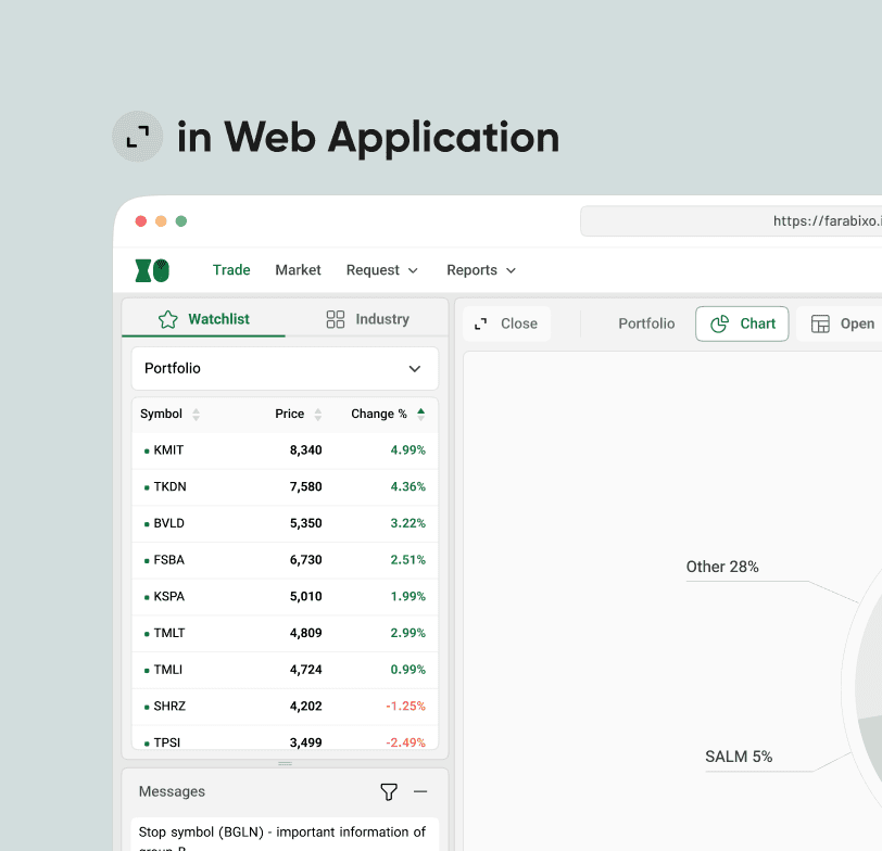
Design Consistency: We created a shared design system pattern between the mobile app and the web app, giving our users a seamless experience.